

In a world where technology reigns supreme, data is constantly being generated. From every click of a button to every online transaction to every social media post, it all adds to already present vast quantities of data in the world. Data is overwhelming. There is so much of it that understanding it and deriving sense out of it can be a real challenge. It is here where data visualization arrives- a hero in the world of data! In this blog, we will understand what data visualization is about- the process of turning data into visuals that tell a story!
What is Data Visualization?
Data Visualization is the method of transforming information into a visual context, like a map or a graph, making the data easier for the human brain to grasp and draw conclusions from. Its primary objective is to make it simpler to spot patterns, trends, and outliers in big data sets. The term is frequently used interchangeably with others, which includes information graphics, information visualization, and statistical graphics.
One of the steps of the data science process states that after data has been gathered, processed, and modeled, it must be visualized in order to draw conclusions. Data Visualization is also a component of the larger data presentation architecture (DPA) field, which targets identifying, locating, manipulating, formatting, and delivering data.
Why is Data Visualization important?
The ability to visualize data is crucial for practically every field. Businesses that gathered enormous quantities of data in the early years of the big data trend require a way to acquire an overview of their data quickly and easily. The visualization tools fit in naturally. Similarly, visualization is essential to advanced analytics. Even for data scientists working on predictive analytics or ML algorithms, sophisticated algorithm visuals make it easier to understand than the numerical results.
Data Visualization offers a rapid and efficient approach to conveying information to all audiences through visuals. Additionally, the approach can help organizations determine the factors that affect consumer behavior, spot problem regions or areas that need more attention, make data more remembered for stakeholders, determine the best times and places to promote specific products, and anticipate sales volumes.
Data Visualization also includes the following advantages:
- The capacity to take in information rapidly, generate better insights, and make decisions agilely.
- A better understanding of the next steps to take in order to develop the organization.
- An enhanced ability to hold the audience’s interest with relevant information which they can easily understand.
- Information distribution is more straightforward, making sharing insights with everyone involved easier.
- Since data becomes easier to access and interpret, organizations do not have a pressing need for data scientists.
- There will also be a better ability to act rapidly on findings and, as a result, achieve success much faster and with fewer errors.
Data Visualization use cases
Following are a few examples of frequent data visualization use cases:
Sales and marketing
According to Statista, $566 billion is the estimated amount spent on digital advertising expenditures in 2022 and is forecast to reach the $700 billion mark by 2025. Thus, marketing teams should closely monitor the sources of web traffic and the methods of revenue generation. Data visualization makes it a breeze to find out the performance of the marketing endeavors and how it affects traffic trends over time.
Healthcare
Healthcare data visualization is rapidly changing the scenario by improving productivity and drawing attention to critical medical breakthroughs. It allows hospitals to track the patients’ well-being, efficiency, expenditure, and customer satisfaction. Tools such as Microsoft Power BI can benefit medical professionals in handling past and prospective diagnoses. Descriptive analytics is an approach where observations on previous data and its function, behavior, and diagnosis can discover the reasons behind certain diseases’ happenings and their origins. Contrary to that, predictive analysis takes previous data to predict the conditions probable to arise and aid in the prevention. Crafting visuals from data tells a story that the readers can grasp at a glance. When healthcare data is well visualized, it can deliver life-saving interventions to the people who require them most quickly.
Finance
While buying or selling an asset, finance professionals must monitor the performance of their investment choices. Candlestick charts are employed as trading tools and aid in analyzing price changes over time by financial professionals. They show crucial data about securities, derivatives, currencies, stocks, bonds, and commodities. Data analysts and financial experts can identify trends by examining how the price has changed.
Logistics
Shipping corporations can determine the best and most efficient international shipping routes with the help of data visualization tools. Forecasting logistics and operations is a pivotal area where data visualization allows to enhance demand-supply matching and handle asset utilization better. As a result, it can benefit better clarity in operations and offer good connectivity in the supply chain.
Retail
Companies need to gather data and transform it into paths, trends, relations, and patterns, as these are difficult to find from numerical data and other representations. Data visualization allows these metrics to achieve a variety of strategic and operational goals. For example, customer data is vital since it provides a snapshot of your customer’s activity. be changed. Simple demographic or geographic data can be transformed into graphs and charts, which makes it a crucial component of forecasting and decision-making. You will be better able to make informed decisions as a result.
Business benefits of Data Visualization
Let us consider the few benefits that data visualization brings to business:

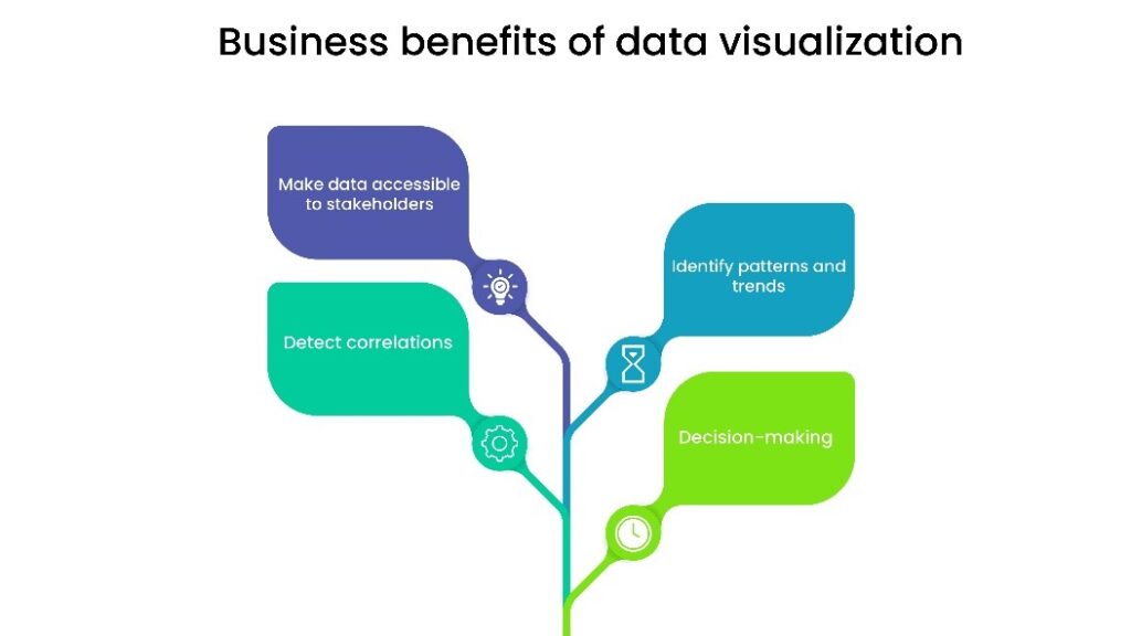
- Enhanced decision-making: The ability of data visualization to make data easier to interpret for experts is one of its greatest advantages. Naturally, this has a significant influence on decision-making.
- Identify patterns and trends: Data visualization is exceptionally beneficial when it comes to identifying patterns or trends. This information is precious for businesses as discovering the patterns allows them to adapt strategies accordingly and implement new marketing and sales approaches.
- Detect correlations: Most firms have several departments, including financial, sales, and marketing, and each of these departments acquires a unique set of data. Whereas marketing concentrates on customer acquisition cost, website traffic, and conversion rate, sales concentrate on revenue, leads, closed transactions, and retention rate. While all of these data are significant, it can also be helpful to find relationships between various indicators. You can use data visualization to discover relationships between variables like recurring revenue and conversion rate or the number of qualified leads and churn rate. Without identifying these relationships, it is difficult to determine how some measurements may affect others and to make informed decisions.
- Making data accessible to stakeholders: Even though every professional is familiar with the data they use, sharing specific insights with stakeholders may be more challenging. When data is interpreted graphically, it is easier for the stakeholders or other teams to understand and thus makes data more accessible.
How can we help?
A robust data visualization tool that helps create insights is Microsoft Power BI. Not only the easy-to-use interface is an added advantage, but also the inbuilt AI capabilities and data security features are easily scalable. Are you looking for solutions that will visualize your data into meaningful stories? Check out Saxon’s data visualization services. We turn your data into business intelligence dashboards tailored to your business requirements. Contact us to create them in hours rather than weeks.